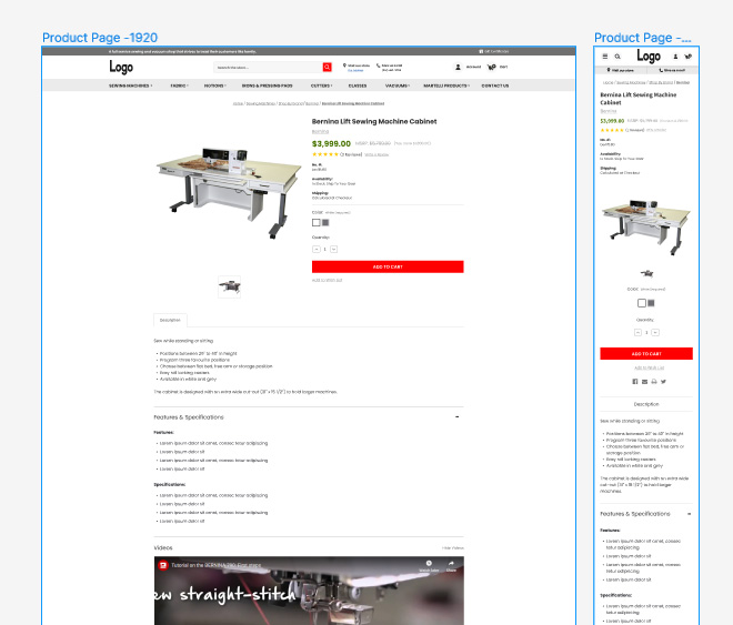
The Perfect Product Page Design for Ecommerce Success

Ecommerce is extremely competitive. You need a lot to be successful including a great product. However, great products are not enough to make sales. You have a job to do! You really need the perfect product page so shoppers can believe you have the best products and value for their money.
No perceived value; no sales.
The entire site must inspire trust and develop a sense of great value in the viewer’s mind for them to want and need to make that purchase. Preferably today. Your product page is key to this goal.
What makes a perfect product page?
There are many components to consider. Each must do their job. From captivating visuals to persuasive copy, every element must work harmoniously to entice visitors and turn them into customers. In this guide, we’ll explore the key components and strategies to craft the perfect product page that not only showcases your offerings but also drives sales.
High-Quality Visuals
Visuals can be drawings, photos, renderings, or even videos. Visuals are the cornerstone of any product page. Your images immediately catch the attention of those who land on your page. Bad images or no images? They are more likely to leave.
Invest in high-resolution images that showcase your product from various angles. Zoom functionality is a must-have so that customers can scrutinize the details. Lifestyle images to help shoppers envision themselves using the product.
While load speed is impacted by size, quality cannot suffer. Most carts do well with a product image that is between 1000-1200 px square. Your primary image should be just the product on a white background. This is an industry standard for most marketplaces too.
Drawings can include dimensions or highlight key features. Additionally, consider incorporating product videos for a more immersive experience.
Stores that have the budget can consider a 360-degree rendering for a full view. Some products also lend themselves to a “try it” feature where they can see the product in use within their own home.
Compelling Product Descriptions
Indeed, most may not read the entire product description but not having one, or worse, having a really bad product description can hurt your ability to convert a page visitor to a buyer.
Craft product descriptions that not only describe features but also highlight benefits and solve pain points. People buy based on emotion and “wants,” not needs. Lead with benefits. Then list the feature that provides that benefit.
Sell the sizzle; not the steak.
Use persuasive language and storytelling to create an emotional connection with the audience. Incorporate relevant keywords naturally to improve search engine visibility while ensuring readability and authenticity.
Clear Call-to-Action (CTA)
Your call-to-action button should be prominent, visually appealing, and communicate the desired action, whether it’s “Add to Cart,” “Buy Now,” or “Add to Bag.”

“Add to your wishlist” is NOT the call to action you want the shopper to make! Many sites benefit from offering a wishlist but since this is a secondary desired action – “do this if you don’t buy today” it should be visually less prominent and either underneath, or to the left, of the Buy Now button.
Use contrasting colors to make it stand out and position it strategically on the page, preferably above the fold. A floating CTA button is a great idea, especially on mobile where pages can require a lot of scrolling.
Many arguments have been made as to which color is the best for your CTA button. I have bad news, there is NO single best color. The only way to know for sure is to do formal A/B testing to see which delivers more clicks and more sales. You need to have good traffic to the testing page – 5000 visitors or more, to get meaningful results. We recommend starting with high contrast which is often red, orange, or green.
Detailed Product Description
In most cases, what the manufacturer gives you via spreadsheet is not remotely adequate for a great product description. Remember, the job of your store is to replace the in-store experience. Your product listing must answer all their questions!
Provide comprehensive product information, including specifications, dimensions, materials, and care instructions. Anticipate potential questions and address them proactively to build trust and reduce hesitation.
Utilize tabs or accordions to organize information and maintain a clean layout. Conversion optimization research suggests that accordion style or horizontal tabs are more effective than vertical tabs. Once again, this is a great matter for A/B testing.
Make it readable.
A great description is not only complete with information but it must be compelling. It needs to touch the “want” button for that shopper. Some of what it should have:
- Marketing copy that touches the shopper – words like best, better, love, etc.
- WHY!!!! Why is this a better use of my money (than alternatives or even buying something else)? (hint: answer this question)
- Focus on benefits – not features. Features support the benefits. An example:
All-day comfort – memory foam footbed is soft and reduces the stress on your foot. Benefit. Feature.
Can you use Artificial Intelligence to write your product descriptions? Yes, you can. Just be sure to verify any specifications or facts presented. I also recommend editing to ensure a consistent voice.
Social Proof – aka Product Reviews
How often do you require or read reviews before you buy? Your shoppers want this too. Integrate customer reviews and ratings to build credibility and reassure potential buyers.
When you choose software for your reviews, pick one that offers the following features:
- Offers users the ability to get written, photo, or video reviews. Videos are GOLD!
- Lets you offer up a public or private response.
- Permits shoppers to leave reviews immediately via the email or text message they will get.
- Sends multiple emails so if they don’t respond initially, they get reminders. Some will connect to your existing marketing email system.
- Offers Q&A – this is a great way to seed the questions that relate to the product description.
Encourage satisfied customers to leave feedback and showcase testimonials prominently on the product page. We do recommend offering a perk for providing a review (or perhaps just a video review) but note that legally, you need to pay out for ANY review, not just good ones.
Highlight positive reviews and address any negative feedback transparently. We also recommend allowing negative reviews to show. This adds a lot of credibility and trust. Responding to the negative reviews shows you care about quality and the user experience.
Mobile Optimization
Depending upon what you sell, your audience may be anywhere from half to 95% mobile visitors. If you aren’t designing a page that works and looks great on a phone, you are losing sales. No “ifs” about it.
Prioritize loading speed and streamline the checkout process to minimize friction and maximize conversions. Get your most important information nearest the top of the page.
Cross-Selling and Upselling Opportunities
Cross-sells are “you may also like” and should be similar items. An example would be showing other blouses on a blouse page.
Upsells are items that go with the product. This is often known as Frequently Bought Together (FBT) or Accessories. An alternative upsell can be a bundle. For example “save $10 on 3 bottles.”
The clever and careful use of either or both can maximize revenue potential. Used incorrectly it can distract the shopper and reduce your conversion rate.
The smartest way to do this is via data. View Glew, your store product data, or even Google Analytics to find which products are bought together. Or choose software that has AI do the work for you.
A clever upsell might be offering a “bundle” or FBT with pants or a skirt often purchased with that blouse. A distraction might be offering other blouses that can make the buyer question their choice. This is one reason cross-sells are usually at the bottom.
Upsells can also be placed in between the Buy Button and the cart page via popup, or even post checkout. All these choices should be tested to see which works best for your audience.
Visual Hierarchy and Navigation
Maintain a clean and intuitive layout with a clear visual hierarchy that guides visitors’ attention to the most important elements, such as product images and CTAs.
Incorporate breadcrumb navigation and intuitive filters to help users easily navigate through your catalog. This will make it faster and easier for your shoppers to navigate to what they want.
On the page, place the most important information closer to the top. On a product page, this is photos, name, and price. Options if they exist should be here too.
When you work into the product description, use your header tags as intended – in an outline format. Usually, the product name is already set as the H1 tag for the page. Use H2 and other header tags in the description page to head sections such as features, dimensions, etc.
Keep in mind that from both an accessibility and SEO point of view, header tags should be used properly and in order. This means an H2 must live under an H1 (on an entire page level), H3 under H2, etc.
Use bold and italics to highlight as well. Bullet points and highlights can make it easy for a shopper to skim the page to get key points without having to read the entire thing. Also keep paragraphs short as big blocks of text are hard to read online.
Trust Signals
Your product can be terrific but shoppers won’t buy if they don’t trust your store. How do you instill trust? Trust badges used to do it but not so much anymore as modern browsers warn when the code is not secure.
Shoppers are more likely to trust a store that has both customer-friendly AND visible shipping and return policies. A formal privacy policy is also a good idea (and required in some locations).
We have found that quick little icons like “free shipping” or “easy returns” near the Buy Button can help. Store-level reviews are also good.
Got any media coverage? That’s a great item to have on your home page or About Us page. Highlight any certifications, awards, or affiliations to reinforce your credibility and differentiate yourself from competitors.
An active social media presence is also part of your trust factor collection. Showing off how customers use your product, such as a product-level instagram display, can also boost your trust.
A/B Testing and Optimization
Continuously monitor and analyze the performance of your product page through A/B testing. Experiment with different layouts, CTAs, copy variations, and visual elements to identify what resonates best with your audience and optimize accordingly.
In conclusion, designing the perfect product page for ecommerce success requires a strategic approach that combines compelling visuals, persuasive copy, intuitive navigation, and trust-building elements.
Focusing on enhancing the user experience and addressing customer needs, so that you create a product page that not only attracts visitors but also converts them into loyal customers.
Remember, consistency and continuous improvement are key to staying ahead in the dynamic world of ecommerce. Keep abreast of industry trends, customer preferences, and technological advancements to refine your product page and stay competitive in the market.
Need help? We have an expert team of writers who absolutely can help you build a great store. Contact us today.
Share this article
Tap into years of experience and turn your site’s visitors into buyers.
Related Posts
-
Choosing the Right B2B Ecommerce Software
Discover the top ecommerce b2b platform options. Compare features, ERP integration & ROI to choose the best for…
-

Beginner’s Guide to B2B Ecommerce Platforms
Discover how a modern b2b ecommerce portal streamlines ordering, integrates with ERP systems, and boosts sales efficiency for…
-

Checkout Optimization Tips to Turn Window Shoppers into Buyers
Discover ecommerce checkout optimization tips to slash cart abandonment by 70%, boost conversions 30%+, and turn window shoppers…