Before You Choose, or Design, a New Template for Your Online Store

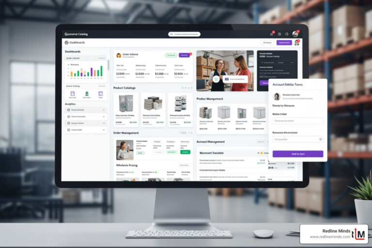
It’s time to refresh the look and feel of your current website. Or perhaps you’re building your very first online store. Either way, you want it to look great. More importantly, you want it to work well so more site visitors buy. This isn’t as easy as choosing a pretty template. Here are some important considerations that you should be aware of before you choose, or design, a new template for your online store.
Responsive design
Simply put, a responsive design is a website design principle where the images, text and other content, resize and shift position based on the size of the screen viewing your site. These days desktop screen vary from small to very large, and can be square or rectangular, and vary quite a bit in proportion. Tablets and mobile screens also vary in size, and content must look good when viewed both horizontally and vertically.
Adding to the complexity of responsive design is that screen resolution also varies, and some users will zoom in or out for easier viewing. Thus the web designer needs to plan for many possible viewing scenarios. When you’re shopping for a new look for your store on your desktop computer, it is very easy to forget that you need to plan for all screens.
Since you have only a few seconds, less than 3, to make a positive impression and ensure that the visitor is on the right page, what they see upon landing is critical to your success.
A picture is worth a thousand words
These days shoppers expect lots of high-quality photos. Videos are also increasingly expected. As you plan your store design, you must find a balance between offering lots of photos and images and store speed.
Images absolutely do sell products. This is proven. Videos can also improve your conversion rates. Quality matters. Unfortunately, high-resolution images often come with a larger file size and larger files take time to load on the screen. This can negatively impact page speed. A slow page loses visitors quickly. It can also hurt your search engine rankings.
So choose your images carefully and optimize for size. When possible consider using an SVG format which allows an image to be viewed on any screen while minimizing file size. Unfortunately, at this time not all shopping carts can accommodate SVG.
So if images can slow a site down, why must you use them? The answer is very simple:
People don’t read.
Shoppers are visual. While some will read every detail; most don’t. So you need to answer their questions visually.
Your home page and main categorical images
Your home page is critically important as it establishes your brand. Visual content is important. The trick here is to plan for responsive design to ensure a good user experience on any device. There is much that can be easily missed when a site is viewed on different devices.
Depending upon your store design, images may not look great on all screens. Some of the common problems include:
- The text is part of the image and not readable on a smaller screen.
- Image crop changes as sizes shift and isn’t attractive on a smaller screen.
- The image may not crop but may still be unattractive on a smaller screen. sometimes it doesn’t get narrow enough and it is partially cut off
- Text that is overlayed on an image may break oddly or not be fully displayed.
- Videos may not adapt in width to be fully viewable.
Here are some of the points to consider when planning your home page images.
User experience (UX)
It’s easy to let your own concepts of attractiveness muddy the waters when it comes to site design. However, it is important to focus on the experience of your site visitors. The easier it is for them to find exactly what they are seeking, the more likely they are to buy.
For this reason, it has been proven that a clean design, free of clutter and an easy to use navigation plan converts better than more complex designs. Your design needs to consider the point of view of a site visitor. It must inspire confidence in your brand and your products.
Shop your competitors
For this reason, we often recommend that store owners shop their competitors and take notes of what they like and what they do not like. Increase and decrease your browser window to see how the store changes as viewable size shifts.
Then take a look at the mobile version on your phone. Can you read all the text? Can you quickly find the shopping cart/checkout, search box, and store contact information?
If the business has a physical location, can that information be quickly found? I’ve always been surprised by how many restaurants don’t have a clickable phone number and a link to directions at the top of their mobile site despite the fact that these are the two top searched for pieces of information.
Planning your navigation
Planning your navigation has two parts. The first part is actually choosing your categorization to make it easy for customers to find related products.
Ease of use is key. Research has demonstrated that the fewer clicks it takes to get to the desired product, the higher the conversion rate. Where possible, avoid going more than 3 levels deep.
If you have a larger catalog, product filters work better than trying to use more child categories. Not only are product filters faster for your users, but they let users combine criteria to create a custom results page.
For example, your shoppers may wish to see all women’s t-shirts that are available in size M, and are blue. This is tedious to do with categories but very fast and easy with filters. These days filters can be easy and inexpensive to add. The added cost, if any, quickly pays for itself in higher sales.
Navigation layout considerations
The second part is to choose how to layout and display your navigation. Navigation is generally broken down into two types – horizontal (across the top of the page) and vertical (usually goes down the left side of the page).
There are pros and cons to each format. Like most decisions, which to use needs to be based on the size of your catalog, the number of categories you have, and the needs of your audience.
Given the requirement that a website look good on all screens, considerations for navigation display on tablets and mobile must be made. On mobile, categorical navigation is nearly always vertical, and hidden within what is called a “hamburger menu” located at the top of the page.

When you click on it, the navigation menu will appear. Here’s what a “hamburger” looks like.
This video discusses the options you have for navigational layout.
In summary
Planning a new design and layout for your online store requires thoughtful consideration of the needs of your audience. This is your opportunity to improve on your existing UX, and create a site that is easier to use and better looking than your competitors.